
Posts kept piling up while the body copy contained not a single image. Covers get optimized on every build, yet an inline img has never once been rendered — which means both the CSS around images and the delivery behavior are effectively untested. This note crams every image and table pattern we are likely to write into one post, then reads the delivered HTML to see what actually happens.
Three basic shapes
First, the three basic shapes: wide, portrait, small. Layout-wise only two questions matter: does an image wider than the text column shrink, and does a small image stay at its natural size?

The wide one should shrink to the full text width. Next, portrait — the shape that affects vertical rhythm the most, since it adds the most scroll.

Finally an image narrower than the text column. It should stop at its natural size instead of being upscaled.

Consecutive placement and vertical rhythm
Placing two figures back to back should simply insert the paragraph rhythm between them. The two patterns use different background tones so the boundary is easy to spot.


An image inside a list item
Step-by-step guides put figures in the middle of a bulleted list. Here we check whether the image follows the list indentation.
- Clear the cache before measuring
- Open the target page and scroll to the figure:

- Record the rendered dimensions as they are
Transparent figures on a dark background
Diagrams are usually exported as transparent PNGs. With no background of their own, whether the lines stay readable on light white and on dark #000 comes down to the stroke color alone. We try mid-tone strokes.
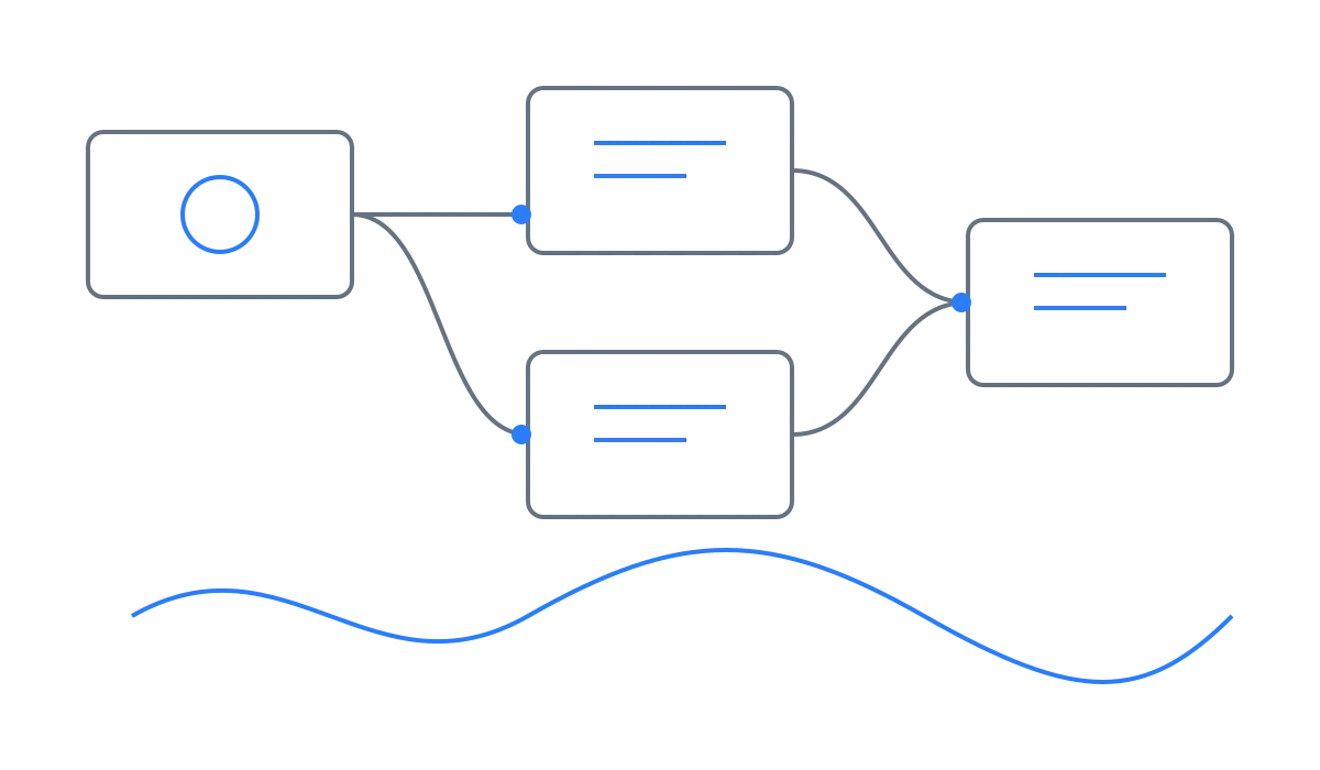
Defaulting diagram strokes to a mid tone that reads on both white and black means you never have to swap images when the theme flips.
Pure-black or pure-white strokes, by contrast, vanish on one of the two themes. This is the place to freeze the drawing convention.
Two kinds of tables
Tables behave differently depending on column count. First an ordinary four-column table, sized to fit even a narrow screen.
| Format | Type | Alpha | Use |
|---|---|---|---|
| PNG | Lossless | Yes | Line art |
| WebP | Both | Yes | Body figures |
| AVIF | Lossy | Yes | Large images |
A wide eight-column table
Next, eight columns that cannot possibly fit at 390px, with deliberately long cells. On a narrow screen the expectation is that only the table’s inside scrolls sideways while the page itself stays put.
| Image | Source size | Output size | Conversion | File size | Alpha | Loading | Notes |
|---|---|---|---|---|---|---|---|
| Wide striped large sample | 1600×900 | Kept as-is | PNG→WebP | 30KB | No | lazy (below the fold) | CSS shrinks it to the text width while dimension attributes reserve the space |
| Portrait bands-and-dots sample | 900×1350 | Kept as-is | PNG→WebP | 11KB | No | lazy (below the fold) | The tall shape is best for observing scroll cost and CLS |
| Transparent line-art diagram | 1200×700 | Kept as-is | PNG→WebP | 14KB | Yes | lazy (below the fold) | The case that verifies alpha survives the conversion |
Two caption options side by side
There are two ways to write a caption. We render both with the same image and compare.
Option A: an italic paragraph right after the image

Option A: an italic paragraph placed straight after the image. Plain Markdown, though CJK italics come out as synthesized slants.
Option B: figure with figcaption
Operational notes
Every measurement starts with a hard reload, Cmd+Shift+R. For checking the delivered HTML, curl beats the devtools:
curl -s https://example.com/en/blog/sample-13/ | grep -o '<img[^>]*>'Every element above now lives in this single post. The delivered width/height attributes, format conversion, and the absence of horizontal scroll at 390px are recorded as measurements in the report.